It’s a fact: People won’t use your website if they can’t find their way around it.
Yesterday’s Web looked far different from today’s Web, and tomorrow’s Web will look more different still. Amidst all of this change, however, one aspect of Web use remains the same: The sites that offer the best, easiest, most intuitive experience are the ones people visit again and again.
To ensure that your sites provide the best user experience, you and your web developer need the essential guide from Steve Krug “Don’t Make Me Think; A Common Sense Approach to Web Usability” (2nd Edition) that distills his years of on-the-job experience into a practical primer on the do’s and don’ts of good Web design. His book is a quick read and while there are a couple of points I don’t agree with for SEO reasons, I agree with his basic concepts outlined below.
The number-one usability rule, most often expressed by users…
1. Don’t Make Me Think. Basically your website visitor doesn’t want to venture into a site that requires them to figure it out. It should be self-explanatory. Web pages should be obvious and self-explanatory. Buttons should have short text and look ‘clickable.’ The default search for your site should be simple.
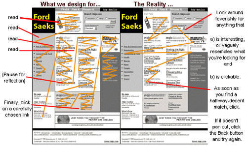
2. Design for scanning not reading. By observing users Krug found that people glance, scan some text, and click on the first reasonable option. People scan Web pages, they don’t read them. We don’t make optimal choices, we click on impulse.
** In our copywriting courses (Ford Saeks), I express that there are two main types of people reading your copy (text in print or online) and those are “scanners” and “readers.” You should write your copy for both types of readers. Give enough headlines, subheads, and bullets along with limited use of bold and color to help the scanner get the gist of the main benefits or message, and then enough information for the reader to get the necessary details. Formatting is just as important as the copy. **
Okay, back to Steve Krug’s Book points…
Here are some things you can do to make sure your users understand as much of your site as possible:
a. Create a clear visual hierarchy to show relative importance of content (H1/H2 etc.)
b. Break pages up into clearly defined areas or sections
d. Make it obvious what’s clickable
e. Minimize noise and distractions
3. Users like mindless choices. We don’t figure out how things work, we muddle through.
4. Omit needless words. Get rid of half of the words on each page, then get rid of half of what’s left. This is especially important on home pages and gateway pages.
** Now this is the point I would take with a bit of caution. I agree about omitting needless words, but keep in mind that you should be designing your site and writing copy for the VISITOR and the SEARCH ENGINES. Effective use of keywords in headlines, page titles and bullets helps catalog your pages in the search engines. Just make sure you do your best to communicate value and benefits, substantiate your claims with features and credibility, and ensure you have a specific and measurable action step on every page. **
5. Navigation: Use street signs and bread crumbs. These visual cues help the reader know which page or section they are on and how to get back. They are a navigation element on the page that reflects the structure of the site’s folders and a path back to home along the folder structure. Basically, bread crumbs are where you are at in relation to home, not the pages you’ve visited.
For example, you visit a page and along the top of the main content area are links…
Success Store >> Products >> Books >> Marketing Magic by Ford Saeks
(Yes, I know that underlined text should be linked. This was just an example of bread crumb navigation)
Factoid: The back button accounts for 30 to 40 percent of all Web clicks. Persistent navigation should appear on every page of the site and should include the following five elements:
a. Site ID – headline, logo, name
b. A way home
c. Search features
d. Sections by relevant content, topic, category, or type of visitor
e. Footer Links
Your navigation should answer these questions:
a. What site is this?
b. What page am I on?
c. What are the major sections of this site?
d. What are my options at this level?
e. Where am I in the scheme of things?
f. How can I search?
6. Your home page should convey the big picture
What is the site about? Use a good short tag line and welcome blurb. Rotate site promotions. Remove everything nonessential.
7. Most Web design usability arguments are waste of time
These “religious debates” consist of people expressing strongly held personal beliefs about things that can’t be proven. All Web users are unique. There are no average users. There are no simple “right” answers for most Web design questions. What works is good, integrated design that fills a need, that’s carefully thought out, well executed, and tested.
The antidote for religious debate is to ask specific questions and test with real users. The last three chapters of the book show how to perform testing on the cheap with three or four users. It’s required reading for my design staff and I’m sure it would be helpful for you!
Have a question… enter it below and I’ll answer it.
 Branding
 Strategic Marketing
 Creative Concepts
 Web Services
 AI Services
 Speaking & Consulting
 Website Maintenance
 Careers
 Tools We Suggest
 10 Tips to Transform Your Marketing


0 Comments