I know, I know – you’re tired of the click-baity titles and the top 10 lists at the end of the year. But hey, they’re not only great eye-catchers, they’re useful. The web is constantly changing, and that’s not a phrase I’m using lightly.
As a developer, I can easily say that something is outdated if I say it looks “so two years ago.” You know you’re really in trouble when I say “that’s so five years ago.” The web changes at lightning speeds, and we love keeping up with those trends to bring the best product for our clients.
However, not all trends are created equally. Some are good, and some are bad. Let’s break it down by the good and bad, and we’ll explain why some of the fads just might fade.
Good:
1. Parallax Scrolling – Not everything needs to be animated, but a lot of websites are including a little animation to their scrolling features. Just check out Prime Concepts’ menu above and watch how it changes.
2. Dynamic charts – These are an incredibly cool use of parallax scrolling or jQuery or SVG (so many options!) that bring visual interest to your site without being overwhelming.
3. Full width video backgrounds – Just check out randygage.com for how great these videos can look. If done right, these can be way more interesting than a set of slides.
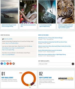
4. Block design – Let’s be honest, everything should be fully responsive soon. Given that there are no “set” standards for devices any more, we have to make sites work on everything from your phone to your tablet to your 29” iMac. Flat, block designs are not only clean and sleek, they are the perfect complement to a responsive website. (Developers love how easy they are to control!)

A great block design from World Wildlife Fund
5. Typography – 2015 will be all about the fonts. With resources such as Google Fonts and webkits, beautiful, interesting fonts are becoming easier to use on the web. Throw in cross-browser support for the beautiful words and 2015 will show us just how much a font face affects your site.
6. Human language – Gone are the days when keywords rule SEO. Google’s algorithms continue to get smarter and put more focus on the reader. This is great news for all of your customers and will make your sites more marketable.
Bad:
7. Parallax scrolling – What? How can this be bad? Well, it’s all about use. Less is more for most sites. It’s easy to go so over the top that users get confused about where they can click.
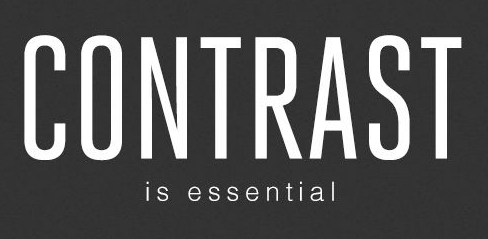
8. Ghost buttons – Ghost buttons really straddle the line for me, much like parallax scrolling. Lacking a background color so they appear to float on top of the page, if there’s not a great enough contrast between the text and the background they can easily get lost on the page.

Not enough contrast on this ghost button means customers just won’t notice it.
9. One page layouts – Don’t jump on me – the one-page, scrolling-instead-of-clicking layout is great for smaller firms and sites that are content-lite. However, what works for some won’t work for everyone, and multi-page sites will still be a necessity for years to come. After all, no one wants to scroll forever, especially on mobile.
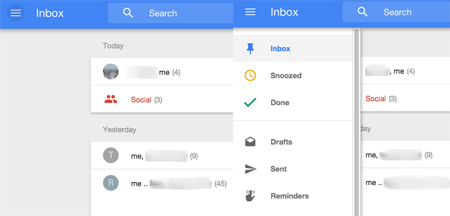
10. Hidden menus – I’ll be honest, this trend will probably only grow. Look at a mobile website that you love. It probably has a simple 3 line icon that you click to get the menu. There are a lot of designers and developers that are using that on desktop, too, with the menu popping out the side typically. I don’t like the hidden menu because I feel it’s bad for User Experience; people are used to it on mobile but not desktop. We’ll see if 2015 proves me wrong, though!

Menus popping out from the side.
 Branding
 Strategic Marketing
 Creative Concepts
 Web Services
 AI Services
 Speaking & Consulting
 Website Maintenance
 Careers
 Tools We Suggest
 10 Tips to Transform Your Marketing


0 Comments